GearFrame Guides
Photography composition —
the invisible architecture
of every great image
Camera gear matters less than where you point it and how you frame the world. This guide covers every major composition principle — from the rule of thirds through the golden ratio — and, crucially, when to ignore all of them.
Divide your frame into a 3×3 grid. Rather than placing your subject dead centre, position it along one of the four grid lines or at one of the four intersections (called "power points" or "crash points"). The result feels more dynamic and natural to the eye.
Power points
The four intersections are where the eye naturally rests. Place your key subject — a face, a focal element, the horizon — on or near one of these points for an image that feels intentional without feeling static.
Horizon placement
Sky-heavy vs ground-heavy
Place the horizon on the upper third to emphasise the landscape. Place it on the lower third to give weight to a dramatic sky. Dead-centre horizons are usually a mistake — they split tension without resolving it.
Portrait subjects
Eyes on the upper third
In a head-and-shoulders portrait, the subject's eyes should sit near the upper-third line. This gives room for the chin and shoulders below, and feels natural — the way we subconsciously read a face.
Moving subjects
Leave space to move into
If your subject is moving — a cyclist, a bird in flight, a running child — position them on the side of the frame they're moving away from. The empty space in front gives the image a sense of momentum and intent.

composition-guide-thirds
Rule of thirds in practice — the subject's eyes sit on the upper-third line, with space to breathe below and on the right.
Camera tip: Most cameras have a grid overlay in the viewfinder or live view display. Turn it on. After a few weeks shooting with it, you'll internalise the thirds automatically — and then you can turn it off.
Lines are the most powerful compositional force in photography. A road, a river, a fence, a shadow, a row of trees — any line your eye follows naturally becomes a leading line when used deliberately. The goal is to guide the viewer's gaze through the frame toward your subject.
Converging lines
Perspective and depth
Two parallel lines (a road, train tracks, a corridor) appear to converge toward the horizon. This creates a powerful illusion of depth and pulls the eye to the vanishing point. Place your subject at or near the point of convergence.
Diagonal lines
Energy and tension
Diagonal lines carry more visual energy than horizontal or vertical ones. A staircase, a sloping hillside, a leaning figure — diagonals suggest movement, dynamism, and instability. Use them when you want energy rather than calm.
Curved lines
Flow and elegance
S-curves (a winding road, the curve of a river, a body in contrapposto) create a flowing path for the eye that feels graceful and unhurried. They're particularly effective in landscape photography and natural scenes.
Implied lines
Gaze and gesture
A person looking to the right creates an implied line from their eyes toward whatever they're looking at — even if that thing isn't in frame. A pointed finger, an outstretched arm, or a shadow can all create invisible lines the eye follows.

composition-guide-lines
Converging lines pull the eye from the foreground to the vanishing point — the strongest version of the leading line technique.
Watch out: Lines that lead out of the frame rather than into it work against you. A road that enters from the left edge and exits at the top-right pulls the viewer's eye out of the image. Reframe so lines lead inward, or redirect them toward your subject.
Framing means using elements within the scene — a doorway, an arch, overhanging branches, a window, a tunnel — to create a secondary frame around your subject. This technique draws the eye to the subject, adds depth and context, and gives images a sense of discovery.
Natural frames
- Tree branches overhead
- Cave or rock formations
- Gaps in hedgerows or foliage
- Reflections in pools of water
- Rolling hills forming a valley
Architectural frames
- Doorways and archways
- Windows and mirrors
- Corridors and tunnels
- Bridges viewed head-on
- Scaffolding and construction
The frame doesn't need to be sharp or even in focus — a soft, blurred foreground frame can be just as effective, adding depth without distraction. In fact, letting the frame go out of focus often works better because it keeps attention on the subject.
composition-guide-framing
A doorway or archway creates a frame within the frame — directing the eye to the subject while adding depth and a sense of discovery.
A subtler use: Framing doesn't have to be symmetrical or formal. A single branch in the top-left corner, or a blurred shoulder at the frame edge, can create enough enclosure to focus the eye without looking contrived.
Symmetry creates calm, authority, and visual satisfaction. Patterns create rhythm. Both reward the eye with order — which is exactly why breaking them with a single unexpected element is so powerful. The disruption becomes the subject.
Reflections
Perfect bilateral symmetry
Still water, mirrors, and polished surfaces create near-perfect reflections. Centre your frame on the axis of symmetry and let the mirrored image take over. Works particularly well with architecture, trees, and mountain ranges.
Architecture
Designed to be centred
Many buildings, corridors, and grand interiors were designed around a central axis. Shooting straight down the axis — dead centre — leverages that symmetry deliberately. The one time centring your subject is absolutely the right call.
Repeating patterns
Rhythm and texture
Tiles, windows in a tower block, rows of crops, a crowd — repeating elements create rhythm. Fill the entire frame with pattern for abstract effect, or let the pattern run to the edge and introduce one break in it. That break is your subject.
composition-guide-symmetry
A still-water reflection creates near-perfect bilateral symmetry — one of the few scenarios where centring the horizon is the right call.
The break rule: A single element that breaks a pattern — one red umbrella in a sea of black ones, one cracked tile in a uniform floor — becomes instantly magnetic. The eye hunts for the anomaly. Use it deliberately.
Negative space is the empty area around your subject — sky, sea, a plain wall, a foggy background. Most beginners try to fill the frame. Restraint is often more powerful. A small subject floating in a large empty space creates a sense of isolation, scale, or contemplative quiet that a tightly cropped image never can.
When it works
- Subject is small, isolated, or lonely
- You want to communicate scale or vastness
- The mood is quiet, minimal, or melancholic
- The background is simple and clean
- The subject has strong, readable silhouette
When to avoid it
- Negative space is busy or distracting
- Subject lacks clear definition or silhouette
- You want energy and tension, not calm
- Background competes with the subject
- Multiple subjects need to relate to each other
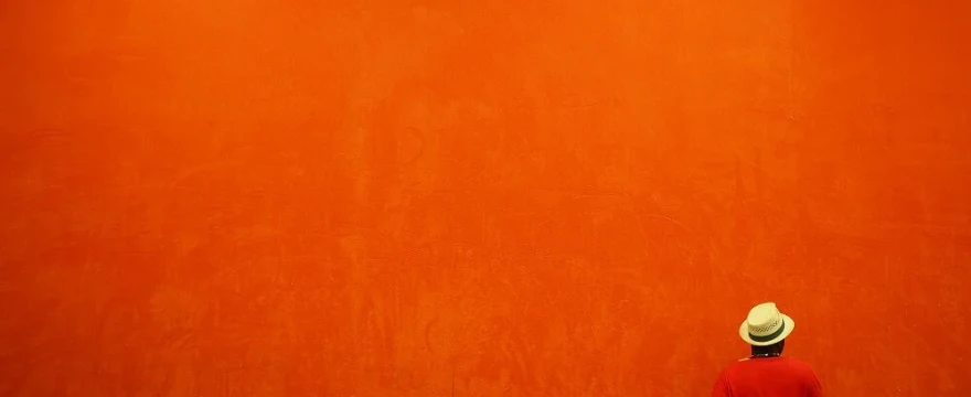
composition-guide-negative-space
A single figure set against a vast, empty background — the subject occupies a fraction of the frame, but commands complete attention.
Lens choice matters: A wide-angle lens exaggerates negative space and makes subjects appear smaller within the environment — good for isolation and scale. A telephoto compresses space and reduces negative space even if it exists. Know which effect you want before choosing your focal length.
A photograph is a flat, two-dimensional surface pretending to be three-dimensional. Foreground elements are one of the most effective tools for creating the illusion of depth. By placing something close to the camera in the lower portion of the frame — rocks, flowers, footprints, a discarded object — you give the eye a near-far journey that adds scale and dimension to the scene.
Landscape photography
Anchor the scene
Without a foreground element, a landscape can feel flat and distant. Wild flowers, tide pools, cobblestones, or even just interesting ground texture in the lower third give the eye an entry point into the scene and pull the viewer forward.
Environmental portraits
Context and layering
Shooting through or past foreground objects — a coffee cup, an open book, a vase of flowers — places your subject within an environment and implies a story. The foreground doesn't need to be sharp: soft bokeh in the foreground works as well.
Wide-angle technique
Get low and close
Wide-angle lenses exaggerate the size of foreground objects dramatically. Getting physically lower — even lying on the ground — and placing an object just in front of the lens creates a powerful sense of scale and immersion that a telephoto can't replicate.

composition-guide-foreground
Foreground interest anchors a landscape and gives the eye an entry point — without it, the scene can feel flat and distant.
Depth of field decision: You can choose to keep both foreground and background sharp (requires a narrow aperture, around f/8–f/16) or let the foreground blur into bokeh (wide aperture, f/1.8–f/2.8). Neither is always correct — the choice depends on whether you want the foreground to feel like information or atmosphere.
The golden ratio (approximately 1:1.618) appears throughout nature, classical architecture, and art. In photography it manifests as the golden spiral — a composition framework where the spiral's centre sits at the point of most visual interest. It's more nuanced than the rule of thirds, and debated as a conscious tool, but understanding it sharpens your instincts for where subjects feel "right".
The spiral's eye
The tightest curl of the golden spiral marks the point of highest visual tension — where the eye wants to rest. Place your subject's most important detail (an eye, a face, the decisive element) at this point, and let the composition flow outward from it.
Rule of thirds vs golden ratio
Close but not identical
The golden ratio's focal point is close to — but not exactly on — a rule-of-thirds intersection. In practice, the difference is subtle. Think of the golden ratio as a refinement of the rule of thirds rather than a replacement for it.
The golden triangle
For diagonal compositions
A variation: divide the frame with a diagonal from corner to corner, then draw perpendicular lines from the other two corners to that diagonal. The triangles formed provide natural zones for subject placement in dynamic, diagonal compositions.
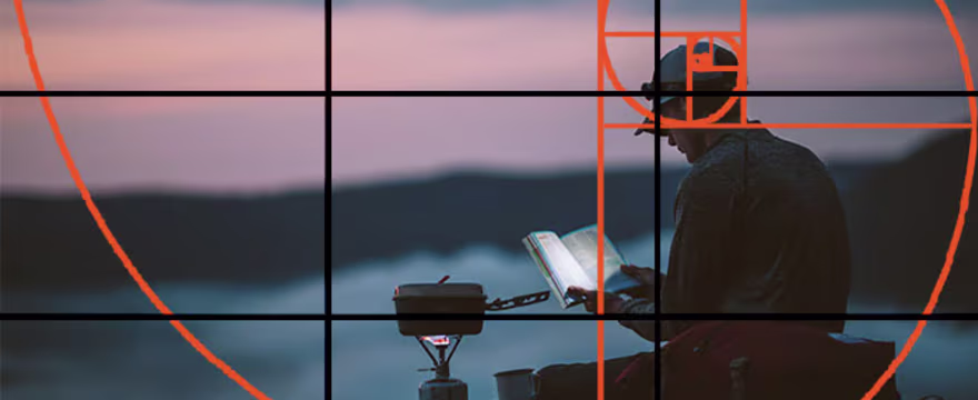
composition-guide-golden-ratio
The golden spiral overlaid on a photograph — the focal point sits at the tightest curl, where the eye naturally wants to settle.
Honest note: The golden ratio is sometimes oversold as a secret formula. Very few photographers consciously apply it in the field — it's too slow. Its real value is in post-processing crop decisions and in training the eye to feel where a composition is working. Study it, but don't be paralysed by it.
Every rule in this guide can be broken — and some of the most memorable photographs in history break all of them simultaneously. The difference between an accidental rule-break and a powerful one is intent. You have to know the rule well enough to understand what you're giving up, and decide that what you gain is worth it.
| Rule | When to break it | Effect achieved |
|---|---|---|
| Rule of thirds | Subject is isolated, symmetrical, or confrontational | Centred subject commands full attention; tension, authority, or unease |
| Leading lines inward | You want to suggest escape, loss, or an open ending | Lines exiting the frame create an open, unresolved feeling |
| Avoid dead-centre horizon | You want perfect calm, reflection symmetry, or abstraction | Horizon at centre creates mirror-like tranquillity or pure geometry |
| Negative space around subject | You want claustrophobia, intimacy, or overwhelming detail | Filling the frame removes breathing room — creates pressure or intensity |
| Keep horizon level | Capturing motion, disorientation, or creative abstraction | Dutch angle (tilted frame) adds energy, instability, or unease |
The goal of learning composition rules is not to follow them mechanically. It's to internalise them until you don't have to think about them — so that when you look through the viewfinder, you're making instinctive choices, not consulting a checklist.
The test: After you break a rule, ask yourself: does this image feel better or just different? Different isn't always better. If a centred subject feels static rather than authoritative, it's not working. Revisit the rule. If it feels charged, deliberate, and alive — you've done something right.
Run through these before pressing the shutter. With practice this becomes automatic — a 2-second mental scan rather than a deliberate process.
- Where is my subject within the frame?
- Is there a stronger power point it could sit on?
- Where is the horizon — is that intentional?
- Are there lines — and where do they lead?
- Is there a natural frame I could use?
- Does the background add or compete?
- How much negative space is too much or too little?
- Is there foreground interest? Should there be?
- Am I standing at the right height?
- Would a step left, right, or lower change everything?
- What would this look like in portrait orientation?
- Is there a pattern I could use — or break?
The bottom line
Composition is a habit, not a formula
No rule guarantees a great photograph. What these principles give you is a vocabulary — a set of tools for making deliberate choices about what the viewer sees, and when they see it. The rule of thirds won't save a bad image. But it will stop you making bad images without realising why they feel wrong.
Learn each rule until it's automatic. Then start breaking them — one at a time, with intention. The strongest photographs usually sit somewhere between instinct and craft: guided by principles, freed by experience.